Your Say, Inner West Council
Motivation for Redesign
The exercise was to redesign the Your Say website by the Inner West Council. The website is a portal for residents to provide feedback on proposed projects, shape council-wide strategies, and be updated on projects underway.
The objectives are particularly interesting to me as I believe that civic engagement can help foster a healthy, connected, and vibrant community which leads to happier lives for its residents.
Evaluating the Current Website
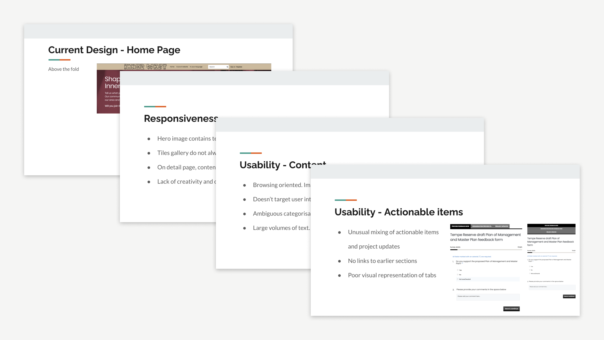
I evaluated the current website through the lenses of content, responsive design, performance, usability, and visual appeal. Both positive and negative aspects fed into the development of my principles and goals of the redesigned website.
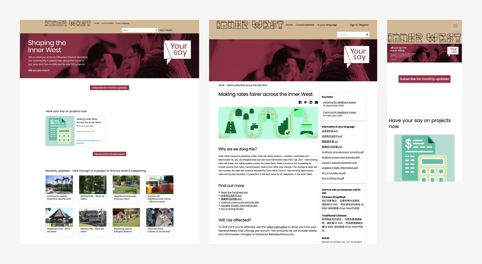
The current website contains a wealth of content broken down into multiple projects and sections. However, the organisation of the projects is very flat and does not have sufficient metadata or controls to help the user find projects that suit their interests.
Additionally the actionable items for the user are not surfaced in a clear manner amongst static content. This reduces the opportunity for engagement and hence impact that the portal could have on the community.
Finally, while the website utilises images to good effect, it lacks visual appeal, and in particular does not employ effective presentation and interaction techniques on mobile screens. The speed and search capabilities feel outdated and would do well with a refresh to lift enagement.
Designing for Modern Users
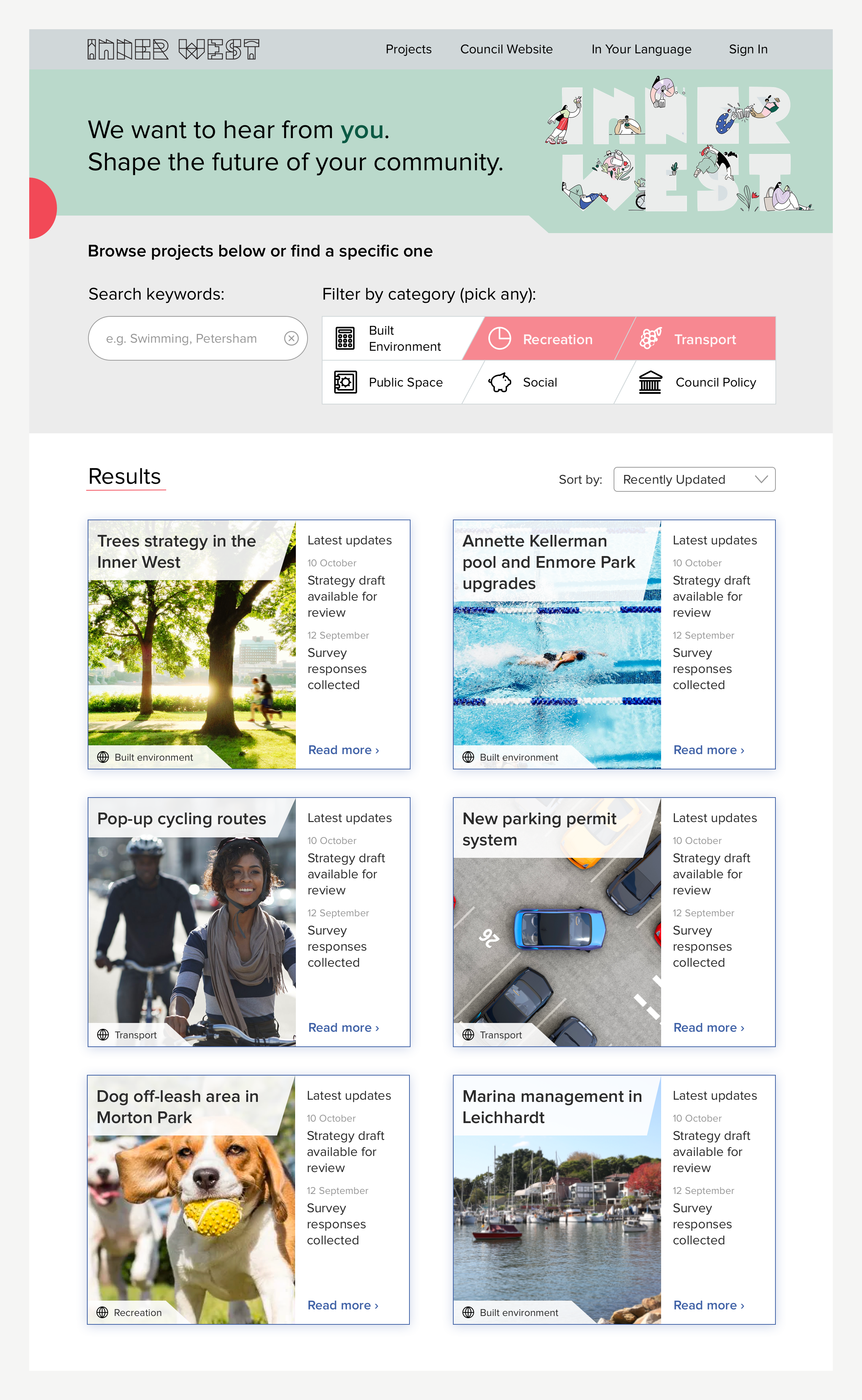
My design vision was to produce an intuitive UI to easily find information relevant to the user's interests. It has a modern look and feel in order to engage both young and old users.
The layout is consistent and clean but not too bland. The pastel colour palette and geometric shape motif was inspired by the Inner West logo, which was produced as part of the Inner West rebranding project.
In comparison to the original design, the redesigned home page provides a much richer set of controls to find and filter for the project that suits the user's interests.
The project tiles provide a good overview of the latest developments and invites the user to find out more.
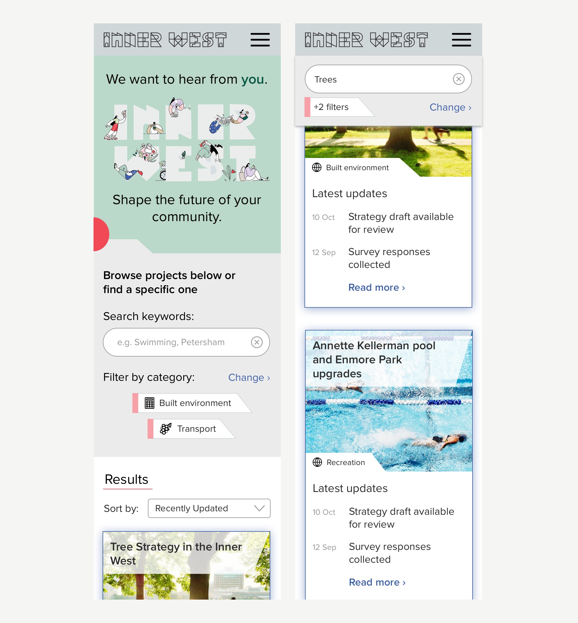
The mobile view presents an equally rich UI for searching, filtering, and quick digestion of information, while maintaining the same stylistic elements.
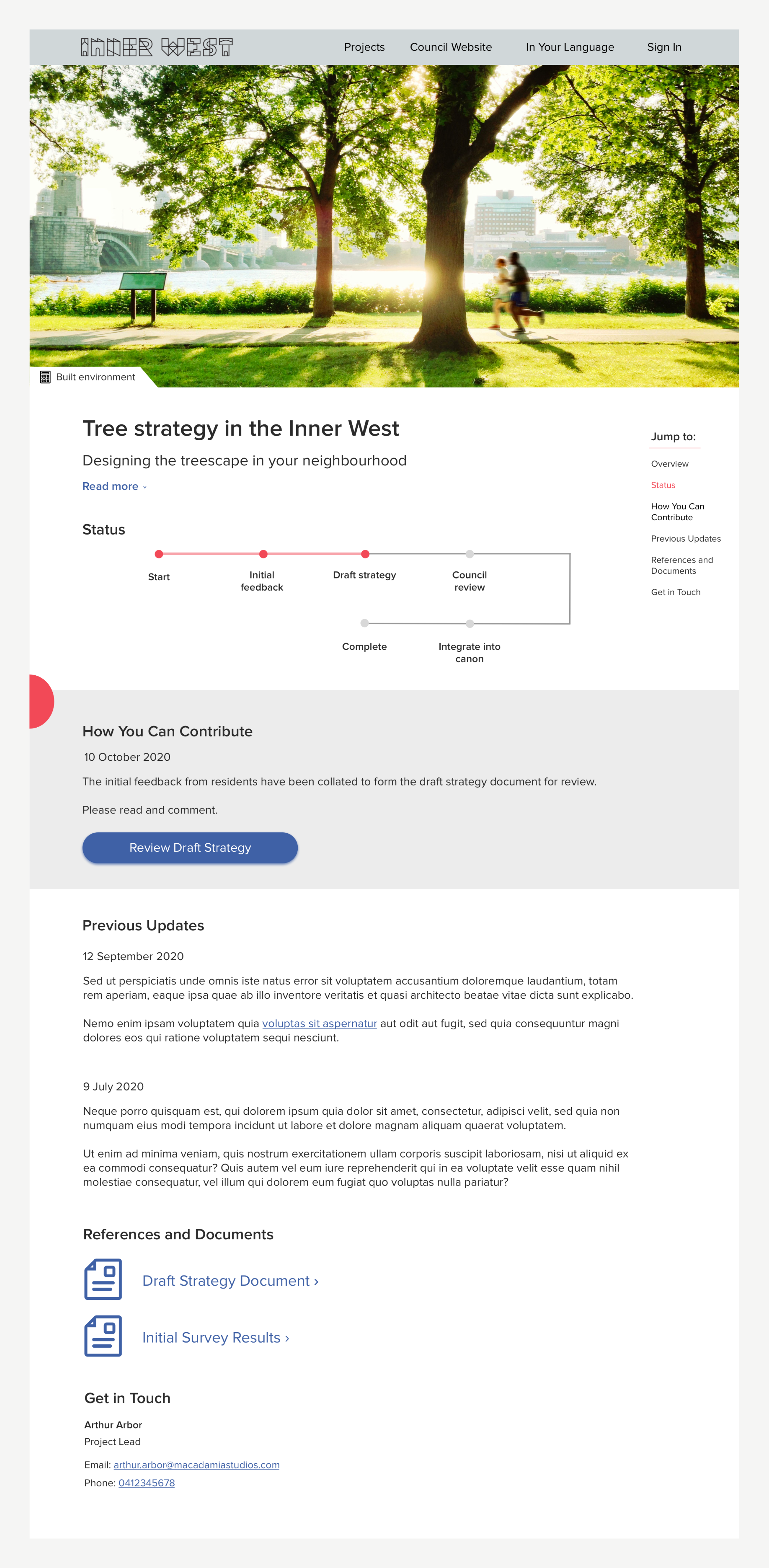
Clear Presentation and Call to Action
The project detail pages provide detailed information on the project summary, progress, and invitations to submit feedback to the council.
Each of these intents have been highlighted with greater clarity in the redesigned page. Typography have been made more consistent and the layout of information flows naturally. Actions that the user can take are given prominence and contextual details are clearly communicated to ensure high quality feedback is received from the community.
Refinement Process
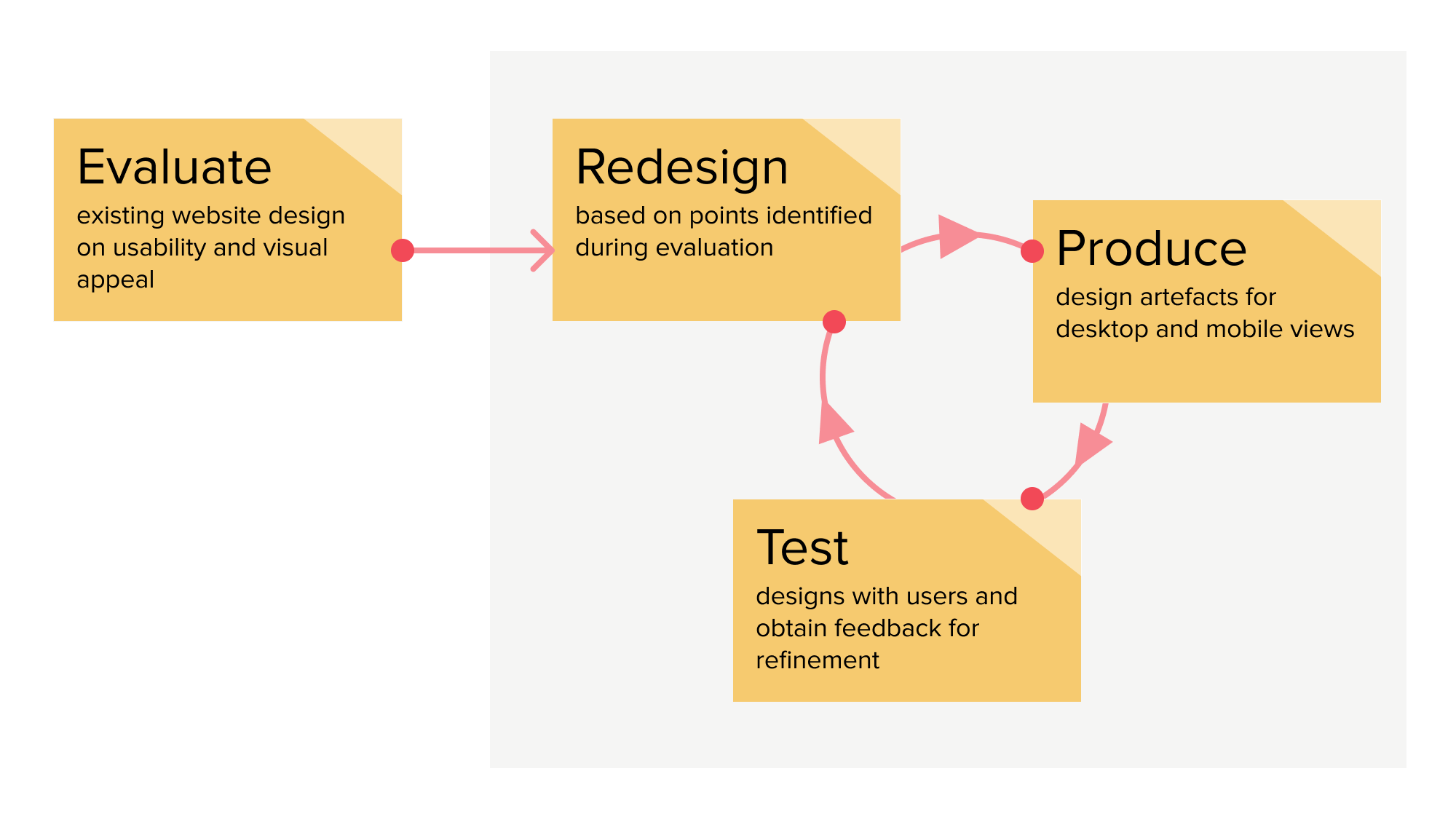
After the initial designs, I implemented a process of feedback and refinement with the help of friends and colleagues. Some had been aware of council engagement websites and others were not aware of them. By conducting user testing and discovering pain points in the way that they would use the new website, I was able to refine the designs to address their concerns and increase their potential engagement.